In his work “The Photographic Message” Roland Barthes discusses the fact that photography, just like other types of visual art, reflects reality but does not exactly emulate it and therefore can be used to manipulate an audience. He drives this point home by listing various examples of techniques used by photographers to deliver a calculated message by altering their photographs and filtering what a viewer sees. This relates to the ideas presented in the photo idea index because both deal with ways that a photograph can be a work of art even though it is generally seen as a straightforward/exact depiction of its subject. Much of what both texts cover is design elements which help to place emphasis on certain areas of an image to send a particular message, or techniques such as Barthes’ “Photogenia” (which means the embellishment of an image through lighting, exposure and printing) which can be used to deliver a message or feeling. Over all the idea is that photography is less a means of copying the real world and more akin to other forms of visual art such as painting and drawing. Photography is about the message the photographer wishes to portray not necessarily the objective reality of the scene it depicts.
Print Ad Analysis
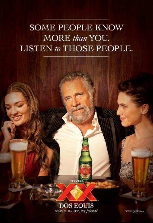
The Dos Equis ad above uses a variety of different design elements in concert to sell their beer. First things first, the obvious center of the image is the bearded man with the partially unbuttoned shirt and heavy tan. The current spokesperson for Dos Equis; the character is known as “The Most Interesting Man in The World”. This character has become an icon, representing the beer in a wide range of print ads to the point where he is not even referred to by name in the ad. However even without knowing the character by name, his manly, Hemingway-esque persona is already communicated by his confident expression and well-dressed, relaxed demeanor. Furthermore he is surrounded by two women, both of whom seem to be literally “interested” in the most interesting man in the world, thus visually communicating to the audience that this person is an authority, potentially on various things, which others look up to. It also uses sex appeal to highlight the character’s importance, and why would desire and trust his opinion. Each of the three people presented in the ad is horizontally aligned with one another, with the most interesting man in the world standing slightly above the two women perhaps to communicate power and dominance. He stares directly into the camera as though making eye contact with the viewer, to offer or perhaps dare them to try the beer. The text: “Some people know more than you. Listen to those people.” is all in white and uses two different fonts, a large print font is used for most of the words while the words “than” and “to” are in a smaller italic font. It once again reinforces the idea that you can trust and should follow the most interesting man in the world’s advice (or emulate his preferences). Lastly the beer itself is contained within the ad on an even line with the most interesting man in the worlds face to clearly identify that he ordered it. There are other beers in front of the two women and on either side of the image where presumably other people are sitting, each of them looks the same, but the Dos Equis( just like the most interesting man in the world) is clearly different and stands out. This suggests nonverbally that while normal boring people might order other drinks, if you were “interesting” you would order a Dos Equis. His white shirt acts as a background to highlight the beer for the viewer. The color palate is warm; using mostly reddish tones and warm wood-like colors this presents the image of a comfortable party scenario. The only actual blue tone in the picture is the most interesting man in the world’s eyes, which makes them stand out and gives them a penetrating quality. Lighting and blur effects are used to accentuate the center of the ad where the most interesting man in the world and his Dos Equis are. The two women and the other beers are darkened and out of focus, to direct all attention to the center of the frame. Through these methods Dos Equis presents itself as a beer for the distinguished well-traveled gentlemen, not the average everyman.
Resume
Business Card
Understanding Comics
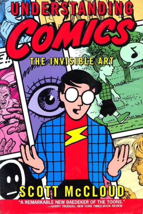
As somebody very interested in visual media as a craft, I found what Scott McCloud of Understanding Comics had to say about the subject to be quite thought provoking. Specifically, regarding the relationship between more realistic depictions and impressionistic icons and the different meanings behind each. For a long time I had tended towards the belief that in art, progress moves in a linear trajectory, which is to say that photo-realistic detail is the height of what an artist might achieve. McCloud however, would argue that less-detailed, less realistic images have the ability to say just as much, in their own way. According to McCloud less detailed characters allow viewers to insert themselves into the narrative, whereas more realistic characters are seen as separate people. Thus each has it’s own purpose, instead of one approach being inherently superior, each has a separate value.


