Final Project: Write Up

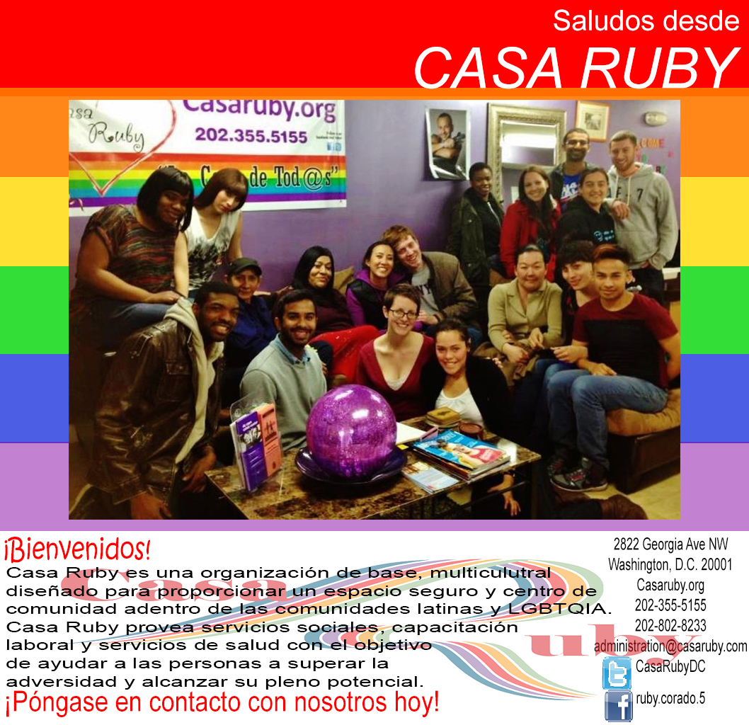
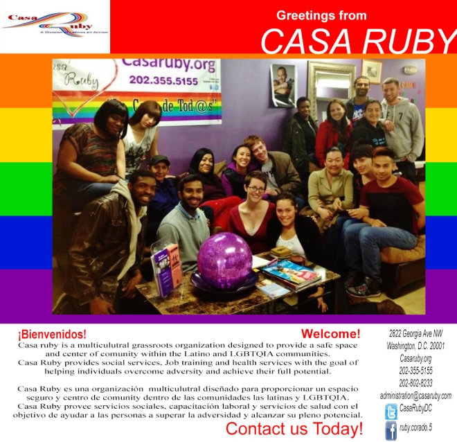
Casa Ruby Write-up: Flier

Overall I found the process of creating this flier to be fun and informative. I have never had to do something like this assignment before and it was a painless experience that I feel was valuable to my general knowledge and perhaps future career life. It not only showed me how to cooperate and work with a group but it also showed me what it is like to work for and with a real world client for a real organization. I feel good that I was (hopefully) able to help in small part, a good cause market itself and in so doing help people. But beyond that this assignment provided a practical application for all of the ideas and design concepts we had gone over throughout the class. When creating my flier I recalled information I had read in the textbooks, listened to in class and seen in photography and film clips we had witnessed. I remembered lessons about the meaning of lines and alignment as well as what fonts to use and why. I remembered lessons about photography and the meaning of images. Even the practice I got creating a resume and business card tied into making my flier the best it could be. There was a very clear continuity between classroom instruction and this assignment. In the end, I enjoyed this class and the final assignment by extension, more than I initially thought I would mostly as a result of how involved and helpful my classmates and professor was in the working process. Any question I had could be easily answered with a quick message to a group member; if I at any point felt directionless in my work all I had to do was take a glance at one of my textbooks or the syllabus to find a jumping off point. As a result of all of these factors I didn’t run into any issues or impediments to my success and therefore I don’t especially have any suggestions for alternative assignments. This project provided me with everything I had hoped for from the class. It taught me about design and made me visually literate and it gave me experience I might need it the future. Perhaps I would have enjoyed a final that was more like the painting to life assignment (creative group film project) because film is my focus, however this assignment was still (perhaps unexpectedly) interesting and fun for me. I have no real complaints.


Painting to Life – Coppertone Ad

For this project our group met a total of three times for filming as well as scheduling over facebook. On the first meeting we planned our project and Sean wrote out a storyboard of the scenes for that day. We collaboratively came up with a general script for our project, utilizing improvisational acting for added comedic effect. We also filmed a few preliminary scenes to get a feel for what the finished project would eventually look like. The second day we reshot some scenes and got the majority of our footage for the upcoming rough cut due date as well as extra B-roll. Sean edited the footage together. Once we received feedback from the class for our rough-cut, we polished and finalized our vision pending the final due date. The final project reflects our hard-work over the past few weeks in bringing our production to life. In this project my main role was as an actor however I also contributed ideas to the storyline and set design. Overall I would say that group chemistry was very good, all of my group members were very professional and knowledgeable in regards to filmmaking and generous with their time, I would gladly work with them again.

Painting To Life: Production Plan

Members of the group: 
Louis Ryan (Lead Actor)
Jaclyn Merica (Writer/Actress/Editor)
Daniel De Castro (Producer/Actor)
Sean Gilfillan (Editor/Director/Actor)

Days we are meeting: 
Sunday, March 30, 2014 from 5-7 (preparing outline, props, and story ideas)
Wednesday, April 2, 2014 from 4-6 (filming)
Sunday, April 6, 2014 from 12- whenever we finish! (finishing filming/editing)

Plot Outline: 
All the group members meet to discuss the assignment.  After remembering Ernest Hemingway’s quote “Write drunk, edit sober”, we decide we’ll be more creative drunk.  Chaos ensues.  The next morning, everyone wakes up realizing we haven’t progressed with the assignment.  Then, a hungover Louis appears in a speedo and wig, like The Coppertone baby, and the group realizes what we can do.  A dog appears and bites his speedo, pulling it down.  Louis is the Coppertone Baby and our video is complete. 

Shot list:

 EXT. APARTMENT COMPLEX – DAY

 FADE IN:

 1. Wide: Establishing shot of apartment

 INT. APARTMENT LIVINGROOM – DAY

 2.Medium of group sitting at round table.

3.Medium CUs on group with dialogue.

4. CU inserts of papers and work on table.

5. Medium of group sitting at round table.

(someone mentions drinking)

 FADE OUT.

 INT. APARTMENT LIVINGROOM – MORNING

 FADE IN:

 6. CU on someone passed out on floor.

7. B-roll of apartment after night of drinking.

8. Medium CU on someone waking up.

9. Medium of LOUIS entrance through door in boxers and wig.

10.Extreme CU on someone’s eyes as they see LOUIS.

11. Medium Wide of someone quickly shaking off crumbs to grab camera.

12. Insert of dog running by.

13. Medium of LOUIS’ boxers being pulled by dog (Freeze frame).

14. CU of someone taking picture.

15. Medim CU of group clapping hands (Freeze frame).

No Country for Old Men – Scene Analysis – First 30 seconds of the included link

This scene could be called a microcosm of the entire movie, as it depicts Llewelyn Moss being pursued by the violence his own greed has brought upon him, a violence which ultimately becomes personified by the disturbing and enigmatic Anton Chigurh. The scene begins in darkness with a long shot that shows the blue light of the pre-dawn horizon and the bright contrasting yellow headlights of a truck alone and framed by the darkness; coming closer. The next shot is another long shot of Llewelyn as he narrowly avoids being shot, focusing the tension and showing just how dangerous the situation is, but still from a distance. Though Llewelyn manages to avoid being shot, the truck continues to pursue him, which as with the other times Llewelyn narrowly avoids death shows how though Llewelyn can miss a bullet or even two, his enemies will not stop and he will never be safe again. In the next scene we pull in to a medium close up of Llewelyn under the truck where he has crawled for cover and we can see the fear in his eyes. This shot serves to place the viewer in Llewelyn’s shoes as we hear the truck approaching and the camera cuts back to the bright headlights coming closer through the blue darkness. Then the camera pulls back to a medium shot as Llewelyn leaves from under the truck and the chase begins. We cut back and forth between the perspective of the pursuers and a shot in front of Llewelyn silhouetted by the headlights. This allows us as viewers to assume the role of the pursuer and the pursued, running in front of Llewelyn and looking back to see the truck approaching. Both shots employ jittering camera movements which provide a sense of immediacy and evoke the feeling of panicked running as the two perspectives near a collision. This scene takes place in an empty desert, though other scenes take place in more populous areas the feeling of lawlessness remains. In the desert, as in the entire movie, there is no one around to save Llewelyn and all he can do is run. The identities of the men who chase Llewelyn remain nebulous because they are in essence a force of nature. The headlights of the truck are not just headlights, but fate catching up with Llewelyn despite his best efforts. The headlights come from the same direction as the sun illuminating the night and they mimic its inevitability, Llewelyn can no more outrun his enemies then he can escape the rising dawn. More evidence of this can be seen in the cover for the film which uses a similar composition to this segment. In the films cover we see the same empty open desert with Llewelyn running for his life. The difference here is that in place of the truck’s headlights we now have the eyes of the nigh-elemental Anton Chigurh rising from the horizon. This is why the people who drive the truck following Llewelyn aren’t identified, because they are representative of violence and the inevitability of fate.

Casa Ruby Flier

Casa Ruby Flier

The main thing I attempted to do with my flier was represent the multicultural aspect of Casa Ruby. Because of the fact that Casa Ruby attempts to provide services for the Latino community I thought it would make sense to have a Spanish translation for the text in the flier for members of the Latino community who might not speak English. I also attempted to represent Casa Ruby as a friendly community oriented environment with the picture I chose. I maintained the current Casa Ruby logo but it may be a good idea to work on the logo and change some of the aesthetics of the ad accordingly. Also I just used google translate for the translation, so it may be better to have an actual spanish speaker translate it to ensure the text is correct.

Subjective Photography: Hands

ImageImageImage

Image

Each of these photographs depicts either my right or left hand however I attempted to use design techniques to give each image a different implied meaning. The first image depicts my left hand lying on a blanket with dark artificial lighting. The palm is open and much of the forearm can be seen. My thinking was that the dark, cold lighting combined with the relaxed look of the hand would make it appear limp and lifeless. I also positioned the camera close to my arm and made the arm fill the frame to give it an almost first person perspective and in theory make the image feel more claustrophobic. The next image is of my right hand in a fist with a white background. It shows less of the forearm because I wanted to focus on the power and aggression that the central image of a fist evokes without the distraction of an overly detailed background. The next image, similar to the first is of an open palmed hand from a first person-esque perspective however there is more depth in the background to denote a more real world setting and the image of the hand is more off to the side. My intent with this image was to evoke a sense of panic and motion by making the hand not resting against anything and partially out of frame. The final image is my left hand in the reflection of a window, as with the previous image the hand is not in the center and is even difficult to see however the framing of the parallel lines of the window and the red lights outside work to underline it. My intention with this image was to grant the hand a surreal, even ethereal quality by borrowing the transparency granted by the window.

Readings Reaction

If a connection can be drawn between the three articles, Ways of SeeingObserving by Watching and Why Time Magazine Used Instagram to Cover Hurricane Sandy, it is that each article deals with how the photography of today is different from the photography of the past. The first article, Ways of Seeing dealt with photography as an art-form and how a photograph can have a symbolic meaning that is subjective and as much based on the intentions of the photographer as on the objective reality of the scene depicted. This article deals more with photography as it has classically understood by the art community. However the other two articles Observing by Watching and Why Time Magazine Used Instagram to Cover Hurricane Sandy, deal more with modern photography (typically captured via IPhone and uploaded to social media) and how the constant dissemination of various images from various sources around the world has connected the human race. Whereas Ways of Seeing puts a great importance on how we might analyze and deconstruct a single powerful image as a work of art, the other two articles point out that photography is also useful (perhaps more so in the modern age) as a means of objective documentation. These readings somewhat enhanced my understanding of the current state of photography as a medium, but rather than being totally revelatory mostly worked to underscore ideas that had already been discussed in Visual Literacy as well as my Literature class. So they did make for interesting reading, but did not especially change my mind in regards to photography.

Photo Essay – Strike

STRIKE PHOTO ESSAY

The word I got was Strike. When I saw what I had been assigned the first definition that came to mind was of a workers strike. So in my Photo Essay I chose to use stock images as well as historical photographs to attempt to not only depict a workers strike but also make a larger point about the place of the working class in America and indeed throughout the world. The first photo is of a desolate Detroit hallway, I chose this photo in an attempt to invite the reader into the world of the working class. The next photo is of child laborers during the industrial revolution. For each of the photos that depict the lives of the working class I chose black and white, to visually represent not only a somber tone but also how these people  had been held back by society. In this image the workers face the camera and their faces are clearly visible to create a human connection. The next image depicts child laborers in a coal processing plant being overseen by older workers. Their faces are turned away to show that they are few among many and that the work they do is repressive and dehumanizing due its poor conditions.  The next image in stark contrast, is in color and depicts men in tuxedo’s walking down the street, smoking cigars drinking champagne and wearing pig masks. This is representative of the wealthy living large and indulging in excess while the poor are forced to toil away. However such inequality creates unrest. The next image shows child laborers involved in an idle demonstration, holding signs and clearly showing their frustration with the aforementioned conditions. Though they do face the camera the image is from farther away than the second image in the slideshow, to once again depict the workers as part of a whole rather than individuals. The next image shows a man reading a newspaper and smirking; the implication being that he is wealthy has heard word of unrest among the workers but is not terribly concerned by it or empathetic towards it. As with some of the other images he does not make eye contact, because this man is intended to represent the wealthy as a group rather than one specific individual. The next image depicts a more violent protest (the Bread and Roses strike of 1912). Workers carrying American flags rush through the streets, their numbers swollen, their anger directed, championing ideas of equal opportunity and the American dream that the flag represents. They are met by a wall of police officers depicted in color as agents of the wealthy elite. They do not exhibit the excitement and fervor of the workers instead appearing calm and unaffected by the brewing storm. The next image, perhaps the most literal of the bunch, depicts a match being struck, representative of the conflict between corporate interests and workers, between rich and poor. The spark of one uprising grows and spreads the next image depicts a towering inferno which is the peoples anger. The next image shows the same site but from farther out, with more fires burning in the distance to show the spreading of the workers movement. But the image is also from farther away, there is more smoke and less flame, the fire seems smaller. In the next image the fire has ended and left destruction in its wake. The workers have struck back against the factory owners winning a victory of some kind. Perhaps better working conditions, or a higher wage. They have shown the power of workers to unite. The next image is a stock photo of people in a boardroom looking at something on a laptop and smiling. This is representative of the factory owners rebuilding, getting ready to pick up the pieces after the workers rebellion. The next image shows a new factory being built, perhaps one where the workers will be treated with more humanity and offered better working conditions. But unfortunately, the next image shatters this hope. Echoing the first image we see similar looking workers lined up and looking at the camera. Their conditions have not changed much, in fact now there are even more of them. But there is a silver lining; where once the workers were children now they are shown to be grown men. In a very literal sense this could be viewed as the passing of child labor laws, however I prefer to view it as the workers preserving their dignity and displaying the fact that the experience of fighting for equality has made them stronger. There will be more striking in the future.

Deconstruction of Newseum Photograph

Image

The above photograph by Stan Grossfeld which won its Pulitzer prize in 1985 depicts the shocking reality of the famine in Ethiopia, captured in 1984. The famine lasted from 1983 to 1985 and effected areas of Ethiopia and Eritrea. It caused approximately one million deaths (according to One.org). From a design standpoint the image depicts what is most likely a mother and child aligned on a vertical plane with one another. The close proximity the two have to each other as well as their respective ages clearly shows their familial relationship. The rule of thirds places the child in the center with the mothers face in the square just above. The mother stands over her child cradling his head in a loving manner, her soft touch clearly shows a bond between the two; however this is not a tender photograph by any means. A look at her face reveals an unfocused stare of resigned hopelessness and it’s pretty clear why. For those raised in wealthy homes where food was never scarce her look may be unfamiliar but it speaks for itself. It is poverty. Instantly recognizable, as the look of somebody unconcerned with day to day matters of television and workplace drama, concerned only with the most basic and primal of needs: survival. “How in the world am I going to feed my family tomorrow and how will I do it the next day, and the next?” She does not have the luxury of considering anything lesser; she is a woman out of options. Though the cloak that frames her face hides much of her body, the mother’s skeletal arms can clearly be seen. Not only has this woman had to worry about finding food for her child, she has also had to find food for herself, neither of which she has likely had much luck with.

The child, who is centered in the photograph and frame by his mother’s hands, has a similar unfocused stare, not directly at the camera, but off to the side and somewhere in the distance. He looks troubled and oddly mature, as though hardship has aged him prematurely. His helplessness is of an entirely different kind; the helplessness of childhood. While the mother must worry about providing food where food is scarce, the child must depend wholeheartedly on his mother to produce food essentially from thin air. Both are powerless to control the future, but the child perhaps even more so for his lack of agency.

If one were to delve into more abstract analysis, one could say that the image has a strong religious undercurrent. The woman in her shawl, surrounded seemingly by a glowing aura with her hands brought nearly together in prayer, is strongly reminiscent of the catholic Madonna, her child then, the baby Jesus. The black and white lighting provides an almost painterly quality. Both stand upright, both dignified despite their clearly difficult conditions, both wise and hardened to the world. Beads around the woman’s wrist and the child’s neck bring to mind prayer beads, with the implication that the woman is praying for her child. Not only are we in the west meant to sympathize with these two, but also to relate to them. These are not exotic foreigners from a different land; they are not people with different customs and ideas about the world, they are avatars of some of our most recognizable literary figures. Good people just like us. People who need saving.